Presbyterian College’s Logos & Assets
A Presbyterian College logo or wordmark is a standardized graphic representation associated with this institution. All items and materials, including departmental, organizational, and student groups bearing official Presbyterian College marks and logos must adhere to the branding guidelines.
Marketing and Communications reserves the right to deny designs that do not meet the College’s brand standards. To maintain brand consistency, any logo variations or requests must be approved in advance by the Office of Marketing and Communications.
Licensing
Due to trademark rights, persons and entities producing items that bear the Presbyterian College name must do so through an internal licensed vendor. You may download a list of these approved vendors here or work through the Auxiliary Services office.
If you would like to become a licensee or retailer for Presbyterian College or have general questions about licenses, please contact the current Director of Auxiliary Services.
Presbyterian College’s collegiate licensing partner, CLC [IMG College Licensing], is responsible for administering the licensing program, including processing applications, collecting royalties, enforcing trademarks and pursuing new market opportunities. Please visit their website for general information regarding CLC or to apply for a license.
Logos
With so many logos to choose from, finding the right one can be challenging. This guide offers downloads and instructions for using our primary, athletic, and departmental logos.
Presbyterian College
Vertical Logo
The vertically stacked, centered logo is the primary logo and is composed of two components: the PC logo mark and the centered wordmark.

Presbyterian College
HORIZONTAL Logo
The horizontally stacked logo is the primary logo and is composed of two components: the PC logo mark and the stacked wordmark.

THE BLOCK PC LOGO
The block PC logo can be used with the wordmark or stand alone.

The Presbyterian College
Wordmark
The wordmark can be used as part of the logo or can stand alone.

Logo usage
Reference this guide for correct application of the PC logos and wordmarks in all media.
The immediate recognition and overall visibility of the Presbyterian College wordmark or signature can be enhanced by maintaining an ample clear area, void of typography or other elements, around the perimeter of the wordmark or signature. This area is referred to as the “clear zone.”
LOGO
Measure the height of the “P” in PC (X). A clear zone, represented by the dashed red line surrounding the logo on all sides, must be equal to or greater than 1/2-X.

LOGO + WORDMARK
Measure the height of the “P” in Presbyterian (X). A clear zone must be equal to or greater than X.
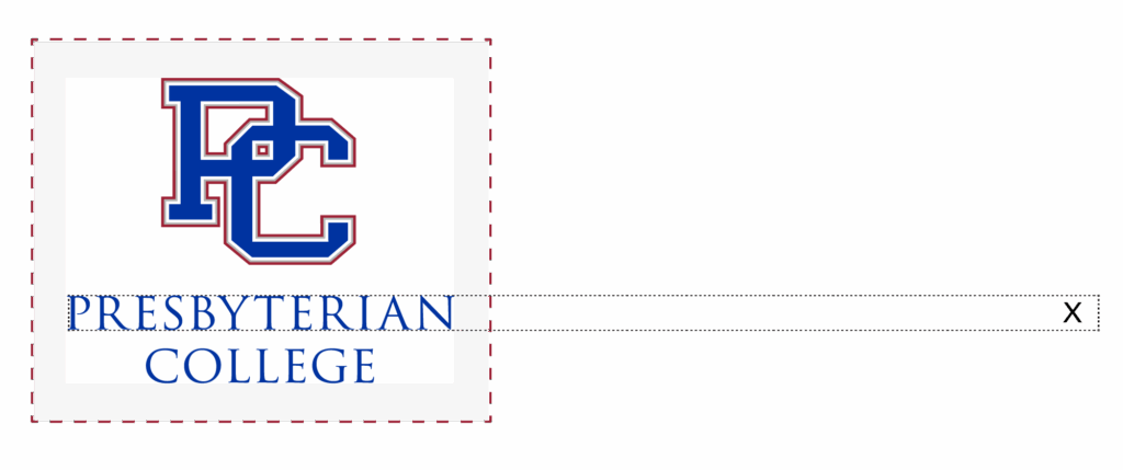
WORDMARK
Measure the height of the “P” in Presbyterian (X). A clear zone must be equal to or greater than X.

The tight application clear zone should be used for applications with limited space.
LOGO
Measure the height of the “P” in PC (X). A clear zone, represented by the dashed red line surrounding the logo on all sides, must be equal to or greater than 1/4-X.

LOGO + WORDMARK
Measure the height of the “P” in Presbyterian (X). A clear zone must be equal to or greater than 1/2-X.

WORDMARK
Measure the height of the “P” in Presbyterian (X). A clear zone must be equal to or greater than 1/2-X.

Always use approved digital artwork; do not attempt to recreate.
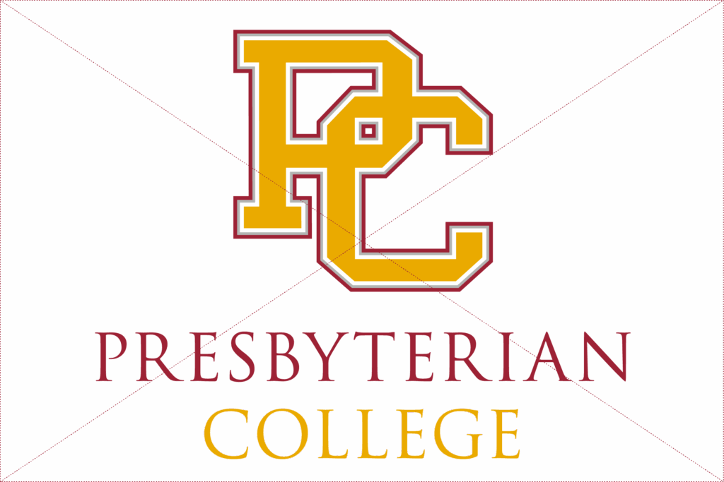
INCORRECT: Using unapproved color combinations.
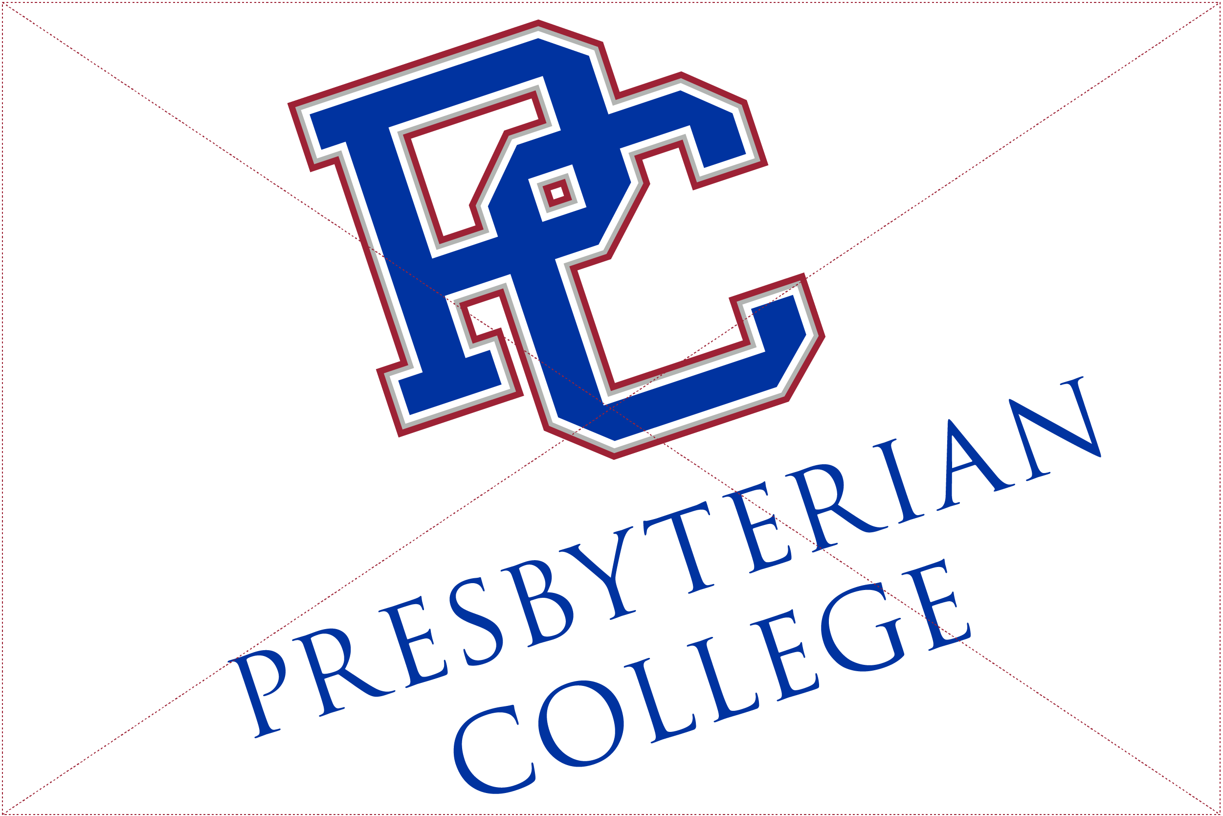
INCORRECT: Skewing or rotating the logo.
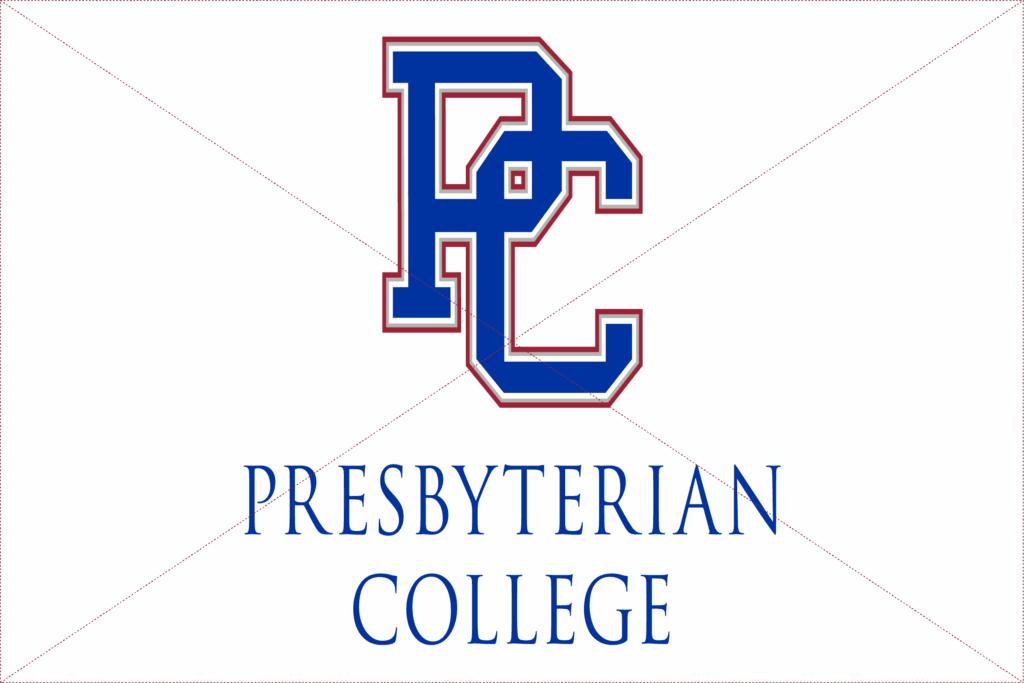
INCORRECT: Improperly constraining or stretching the logo.
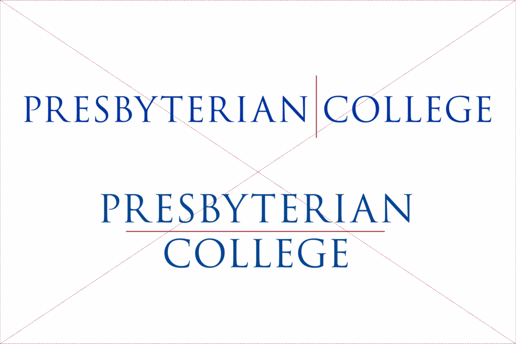
INCORRECT: Splitting or dividing the wordmark.
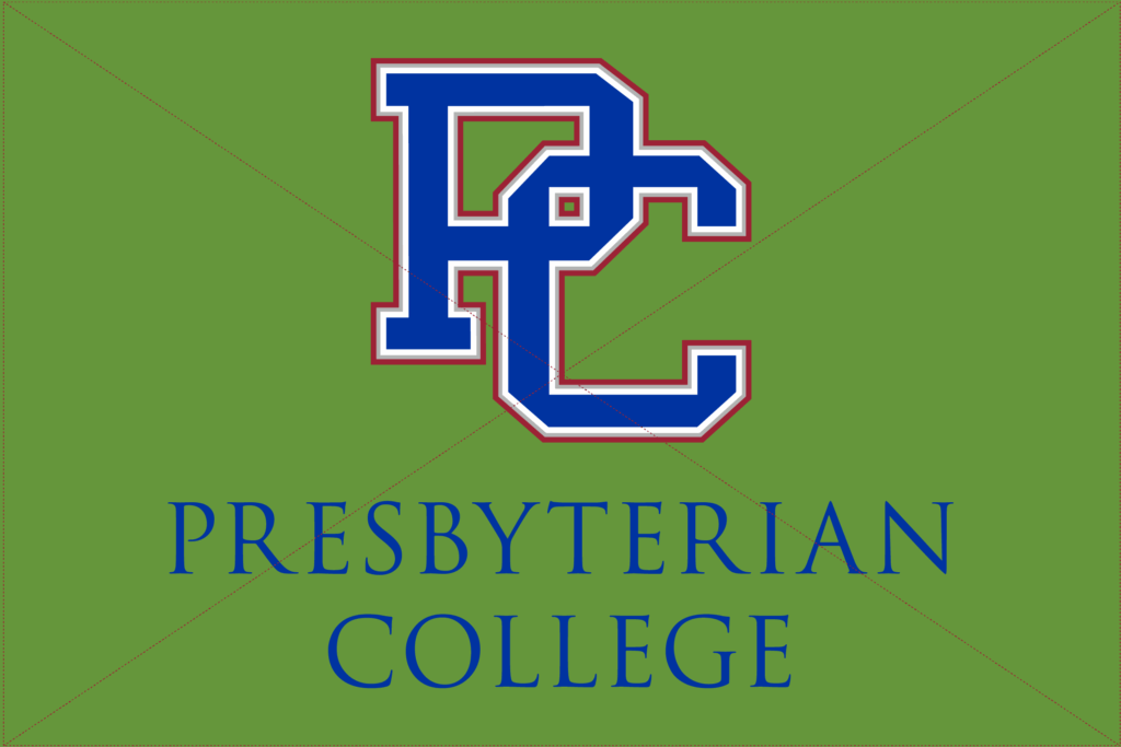
INCORRECT: Placing the logo on a low-contrast background.
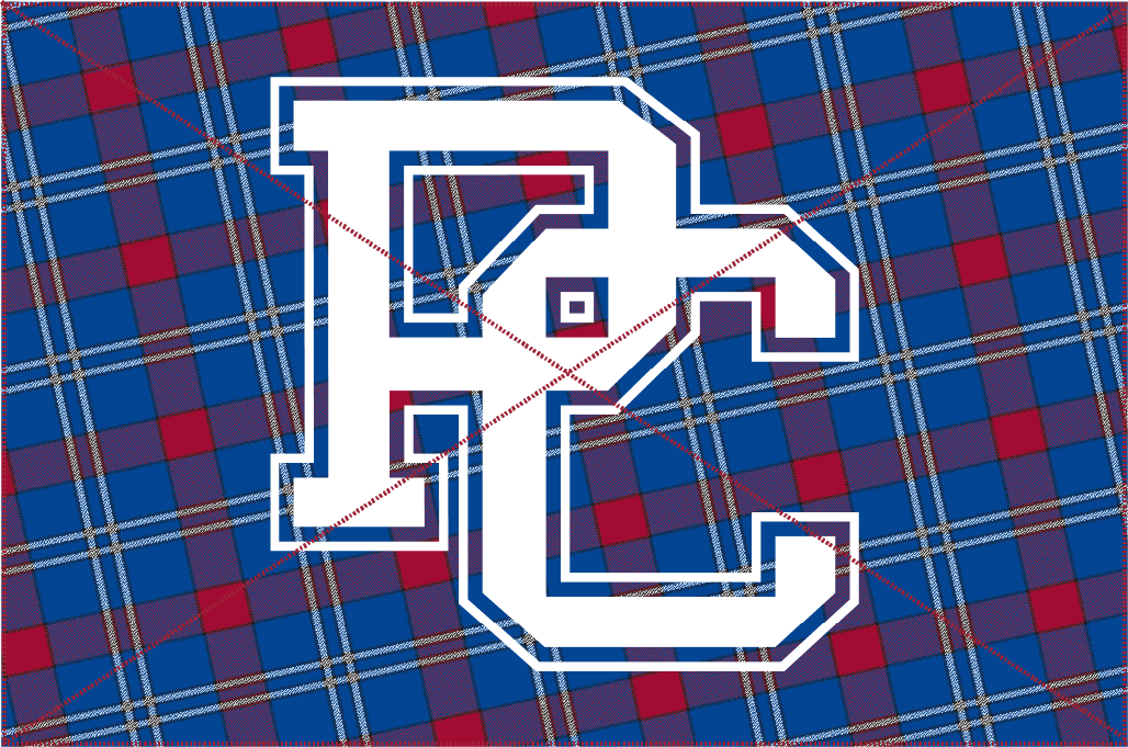
INCORRECT: Placing the logo on a striped or busy background that competes visually and diminishes brand clarity.
Instead, use a clean, uncluttered background behind the logo. If needed, fade or simplify the area, such as placing a solid blue block behind a white PC logo to separate it from a busy blue pattern, to ensure visibility and impact.
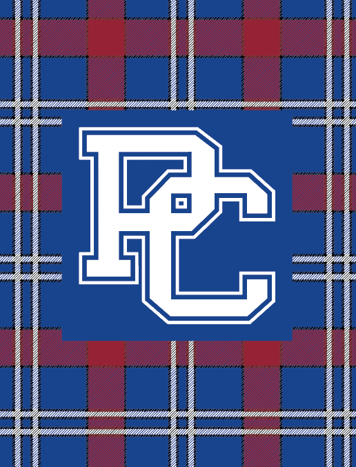
Use on Patterned Backgrounds
✓ Place a solid, high-contrast color block directly behind the logo to encase it and separate it from any patterned or visually busy background.
The color block should:
- Be solid (no gradients or textures).
- Offer strong contrast with the white logo for maximum legibility.
- Provide ample padding around the logo to avoid crowding.
Use this approach specifically when placing the logo over:
- Textured or patterned designs (including the “grungy” halftone dots)
- Tartan backgrounds (such as the example pictured)
- Photographic or illustrated scenes

Use on Black Backgrounds
✓ The 2-color blue and white logo may be used only on black backgrounds (primarily for embroidered apparel or merchandise where the one-color logo may not work).
- Offers better contrast and visibility on dark surfaces.
- White elements ensure legibility; blue maintains brand recognition.
- Not for use on lighter or busy backgrounds; use the standard logo instead.
Go True Blue
The brand line—designed to stand alone as a statement or be part of the full signature.

Presbyterian College + Go True Blue
HORIZONtal logo
The horizontally stacked PC Go True Blue logo is composed of these components: the block PC, the horizontal wordmark, and the horizontal Go True Blue brand line.
Signature
The signature — the logo and brand line combined.
(This is primarily used on the web and digitally for email signatures.)
First, copy the information in the example column and follow the instructions below based on the email setup used to access PC email. Paste the information from the example column in the designated field when instructed, replace with personal information, and save. That’s it! The branded email signature is now set up.
Gmail:
- Open Gmail and click the gear icon (Settings)
- Select “See all settings”
- Scroll down to “Signature” section
- Click “Create new” and name the signature
- Paste the copied signature information in the text box and customize with personal details
- Choose when to use it (new emails, replies, etc.)
- Save changes
Outlook (Desktop):
- Go to File > Options > Mail
- Click “Signatures”
- Click “New” to create a signature
- Paste the copied signature information in the editor and customize with personal details
- Set default signatures for new messages and replies
- Click “OK” to save
Outlook (Web):
- Click Settings gear > View all Outlook settings
- Go to Mail > Compose and reply
- Paste the copied signature information in the text box and customize with personal details
- Toggle “Automatically include my signature on new messages”
- Save
Apple Mail:
- Go to Mail > Preferences > Signatures
- Select the email account
- Click “+” to add new signature
- Paste the copied signature information and customize with personal details
- Drag to set as default if desired
—
Name
Title
O: (###) ###-#### | M: (###) ###-####
503 S. Broad Street | Clinton, SC 29325
Presbyterian College
SEAL
The college seal may be used on formal and official institutional documents and collateral. Use must be approved by the President’s Office.
Note: The use of the PC seal is not permitted on apparel or any other unapproved merchandise, including but not limited to t-shirts, mugs, and hats.
Other Logos
Graduate programs, athletics, and departmental logos provide focused brand applications while maintaining True Blue consistency.
PC School of Pharmacy
Vertical Logo
The vertically stacked, centered logo is the primary logo for the PC School of Pharmacy and is composed of two components: the PCSP logomark and the centered wordmark.

PC School of Pharmacy
HORIZONTAL Logo
The horizontally stacked logo is a primary logo for the PC School of Pharmacy and is composed of two components: the PCSP logomark and the stacked wordmark.












Blue Hose
Athletic Logo (wordmark)
The Presbyterian College Blue Hose logo is approved for use in communications and on merchandise. This is the primary athletic logo.

“Scotty” the Scotsman
MASCOT Logo
The Presbyterian College mascot, also known as “Scotty” the Scotsman, is approved for use in communications and on merchandise.

scotty blue hose Logo
This logo is composed of two components: the mascot logo mark and the centered athletic wordmark.
PC Blue HOSE Logo
Athletic Sub-Identities and
SPORTS-SPECIFIC LogoS
Athletic text-only
This is the preferred version and is used in most communications. This consists of the PC wordmark and the athletic Blue Hose wordmark.

Sport – Preferred
This is the preferred version and is used in conjunction with a sport. The sport name may be placed to the bottom right of the logo using the Univers 55 Roman font.

Sport – Centered
This is used in conjunction with a sport. The sport name may be centered below the logo using the Univers 55 Roman font. Ideal for longer sports names (for example, Women’s Basketball)

Athletic
Uniforms
Logo Usage
The full-color logo is preferred on all uniforms and equipment to maintain brand integrity. On dark backgrounds where the full-color version is less effective, a one-color white logo may be used as an alternative.
Color Standards
“PC True Blue” (PMS 286) is the official and primary color for home uniforms. Please match this color as closely as possible, within the limitations of fabric and material. Secondary colors include “Tartan Red” (PMS 201), black, and “Rail Steel Gray” (PMS 421).
Typography
All fonts used on uniforms should appear in bold. Always include the full College name or mascot name (Presbyterian College or Blue Hose) in the design (both together are preferred when space allows).
- Baseball and softball may continue using traditional sports script fonts.
- However, the Strikeout font, a collegiate-script, is strongly preferred, or another similar font.
- The Redwing font, a collegiate-style block serif, is also encouraged across all sports for its bold and authoritative presence.
Note: The Director of Athletics will approve all designs for uniforms.
Official departmental and office logos are available in the shared Google Drive folder.
Clear Zone
Measure the height of the “P” in Presbyterian (X). When adding a department or program, use the font Univers LT STD 55 Roman. The point size of the Univers font should appear at 60% of the height of X.

ASSETS
The assets of the Presbyterian College brand are standardized graphics associated with this institution and the current brand campaign. To maintain brand consistency, any asset variations or requests must be approved in advance by the Office of Marketing and Communications.
“Grungy Dots”
HALFTONE DOTS
More than decoration—the ‘grungy’ halftone dots are part of PC’s visual DNA. They add energy and depth to brand applications while maintaining the authentic True Blue aesthetic.
The halftone dots appear as a subtle feature across the website.
Various color options of the halftone dots are included in the shared internal Canva brand kit.


INCORRECT: Distorting or stretching halftone dots, which creates an undesired polka dot effect.

INCORRECT: Applying body copy over halftone patterns without proper contrast consideration.
If you find you need assistance using them, please reach out to Marketing and Communications directly with the dimensions you need them in to fit your specific needs.
Swoops and
WAVES
Fluid movement that reflects PC’s dynamic spirit. The swoops and waves add motion and flow to brand applications, creating visual energy that complements the True Blue identity.
Swoops are custom visuals that swirl off letterforms, created by the Marketing and Communications team in combination with the Strikeout collegiate script font.
Waves are a key feature across the website, while swoops appear more selectively (notably on the homepage and select additional pages).
Various color options of the waves are included in the shared internal Canva brand kit.


resources
Bring the PC brand to life with these ready-to-use resources.
PC Digital Spirit Pack
Make your digital presence as bold as your Blue Hose spirit. Download wallpapers, profile pics, and cover photos that show you’re part of a community that serves, leads, and conquers challenges together. Available now—because True Blue never goes out of style.
