Presbyterian College’s Colors & Typography
The visual language of True Blue. Colors and typography are foundational elements of the Presbyterian College brand—they reflect the college’s identity, set the tone for communications, and ensure a consistent and recognizable visual presence across all platforms. These carefully chosen colors and fonts work together to communicate PC’s values and personality in everything from digital platforms to campus signage. Thoughtfully applied, these elements help communicate with clarity, professionalism, and personality.
Color Palette
True Blue is at the heart of Presbyterian College’s identity. The color palette complements this signature blue while providing the versatility and instant recognition that defines the PC brand. It is permissible to use screens, or tints, of these colors to enhance readability or for aesthetic reasons.
Color is a key part of Presbyterian College’s identity. The college’s palette ensures instant recognition and sets the tone for all communications. To maintain visual consistency, use only the colors outlined here. Primary colors should be used most often, secondary colors sparingly for emphasis, and accent colors rarely—especially the accent yellow. Tints or screens of these colors can be used to improve readability or for aesthetic purposes. For accurate color reproduction, use Pantone for offset printing and signage, CMYK for digital printing, RGB for digital applications, and Hex for web use.
Note: Always use the provided color values, which are optimized for print and screen.
Primary Colors

PC TRUE BLUE
Pantone 286
CMYK: 100 / 80 / 0 / 12
RGB: 0 / 51 / 160
Hex: #0033A0

TARTAN RED
Pantone 201
CMYK: 7 / 100 / 68 / 32
RGB: 157 / 34 / 53
Hex: #9D2235

RAIL STEEL GRAY
Pantone 421
CMYK: 1 / 0 / 1 / 29
RGB: 178 / 180 / 179
Hex: #B2B4B3
Secondary Colors

CLINTON NAVY
Pantone 2955
CMYK: 100 / 45 / 0 / 60
RGB: 0 / 56 / 101
Hex: #003865

JACOBS RED
Pantone 1817
CMYK: 0 / 49 / 49 / 60
RGB: 102 / 52 / 52
Hex: #643434

CORNELSON FOUNTAIN BLUE
Pantone 292
CMYK: 56 / 23 / 0 / 9
RGB: 102 / 178 / 231
Hex: #66B2E7

CELTIC CROSS GRAY
Pantone COOL GRAY 1C
CMYK: 29 / 23 / 23 / 0
RGB: 183 / 183 / 183
Hex: #D9D9D6

GRADUATE GRAY
Pantone 445
CMYK: 3 / 0 / 3 / 60
RGB: 99 / 102 / 100
Hex: #636664

GRADUATE GARNET
CMYK: 7 / 100 / 68 / 55
RGB: 107 / 0 / 37
Hex: #6B0025
Accent Colors

Pantone 1265
CMYK: 32 / 16 / 0 / 40
RGB: 104 / 129 / 151
Hex: #688197

Pantone 290
CMYK: 22 / 8 / 0 / 7
RGB: 184 / 216 / 236
Hex: #B8D8EC

Pantone 124
CMYK: 0 / 27 / 100 / 8
RGB: : 234 / 170 / 0
Hex: #EAAA00

Pantone 877
Metallic Silver
Web Colors
Digital and web applications must also adhere to the established core color palette without deviation.
Accent colors require limited application and are typically reserved for minor color adjustments in web or digital elements. These accent colors are not appropriate for headings, links, or primary design components.
Accessibility: Proper color selection is essential for user-friendly web and digital experiences. Color choices must not impede users’ ability to access or read page content. Avoid using colors with poor contrast, such as red text on a blue background or blue text on a red background. Use white text instead for better readability.

PRESBY BLACK
Hex: #2B2B2B

PRESBY WHITE
Hex: #FFFFFF

CLAYMORE GRAY
Hex: #F7F7F7
TYPOGRAPHY
Adobe Caslon Pro and Univers—Presbyterian College’s primary type families—are used in most communications. Your message matters, but how it appears on screen or in print can be just as impactful. Skip the Comic Sans—here are the college’s preferred fonts.
These fonts are available for internal use.
Primary & Secondary Fonts
Consistent typography is essential to the PC brand. Adobe Caslon Pro, Univers, and select accent typefaces are reserved for designers in the marketing and communications office producing external materials for Presbyterian College.
Adobe Caslon Pro is versatile—ideal for headlines, body text, and captions—while Univers offers boldness and clarity, making it best for support and body copy.
Accessibility: Emphasize key headlines and callouts with bold or semibold formatting. There’s no need to layer multiple effects like bold plus underline—one formatting choice provides cleaner, more effective emphasis.
PC (Windows):
- Download the font file (.ttf or .otf)
- Right-click the font file
- Select “Install” or “Install for all users”
- The font is now available in all programs
Alternative PC method:
- Download the font file
- Open Settings > Personalization > Fonts
- Drag and drop the font file into the window
- Font installs automatically
Mac (Apple):
- Download the font file (.ttf or .otf)
- Double-click the font file
- Click “Install Font” in the preview window
- The font is now available in all applications
Alternative Mac method:
- Download the font file
- Open Font Book (Applications > Font Book)
- Drag the font file into Font Book
- Font installs automatically
Note: You may need to restart applications that were open during installation for the new fonts to appear in their font menus.

Trajan Pro
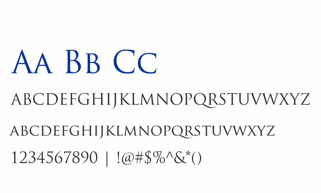
Trajan Pro is the typeface used in the college’s wordmark and forms a key element of the Presbyterian College logo. Outside of logos and wordmarks, it is typically reserved for formal contexts such as event programs (e.g., commencement), presidential inaugurations, and other high-profile ceremonial occasions.

Adobe Caslon Pro
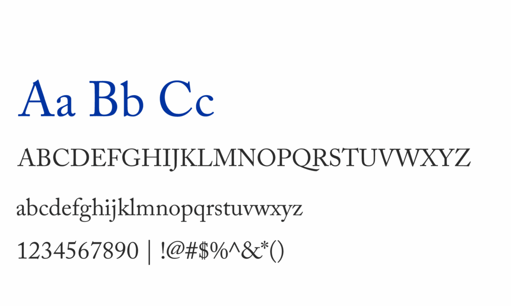
Adobe Caslon Pro, a classic serif typeface, is typically used for headlines and introductory text, but it can also work well for body copy. It can be very sparingly used in logos or wordmarks.

Univers
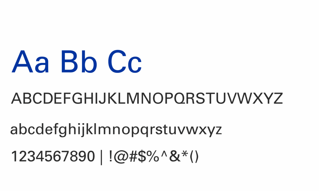
Univers, a modern and highly legible sans serif typeface, is primarily used for body text but is equally effective for headlines and introductions. The college has internal access to over 25 variations of the font.
Light, Roman, Oblique, and Bold are the most used styles and are approved for regular use, particularly in body copy.
While some variations are rarely used, they remain part of the complete Univers font family available internally. The primary versions—Bold, Standard, and Light—are included in the shared internal Canva brand kit.
Accent/Display Fonts
Our accent typefaces are intended to play a supporting role in communications, adding emphasis to callouts or highlighted text.
They should not replace our primary or secondary fonts in body copy but may be used as primary fonts on merchandise. Best practices for using these fonts include applying them to headlines and callouts, event and athletics-themed designs, spirit and campaign graphics, and select social media content.
Aa Bb Cc
ABCDEFGHIJKLMNOPQRSTUVWXYZ
abcdefghijklmnopqrstuvwxyz
1234567890 | !@#$%^&*()
Redwing
Redwing, a traditional block sans serif with a collegiate style, offers a wide range of weights for versatility. The hairline, thin, heavy, and black variations of this font should be used minimally, if at all.
This font is included in the shared internal Canva brand kit. Note: Access to the download is limited to the internal PC community.
Aa Bb Cc
ABCDEFGHIJKLMNOPQRSTUVWXYZ
abcdefghijklmnopqrstuvwxyz
1234567890 | !@#$%^&*()
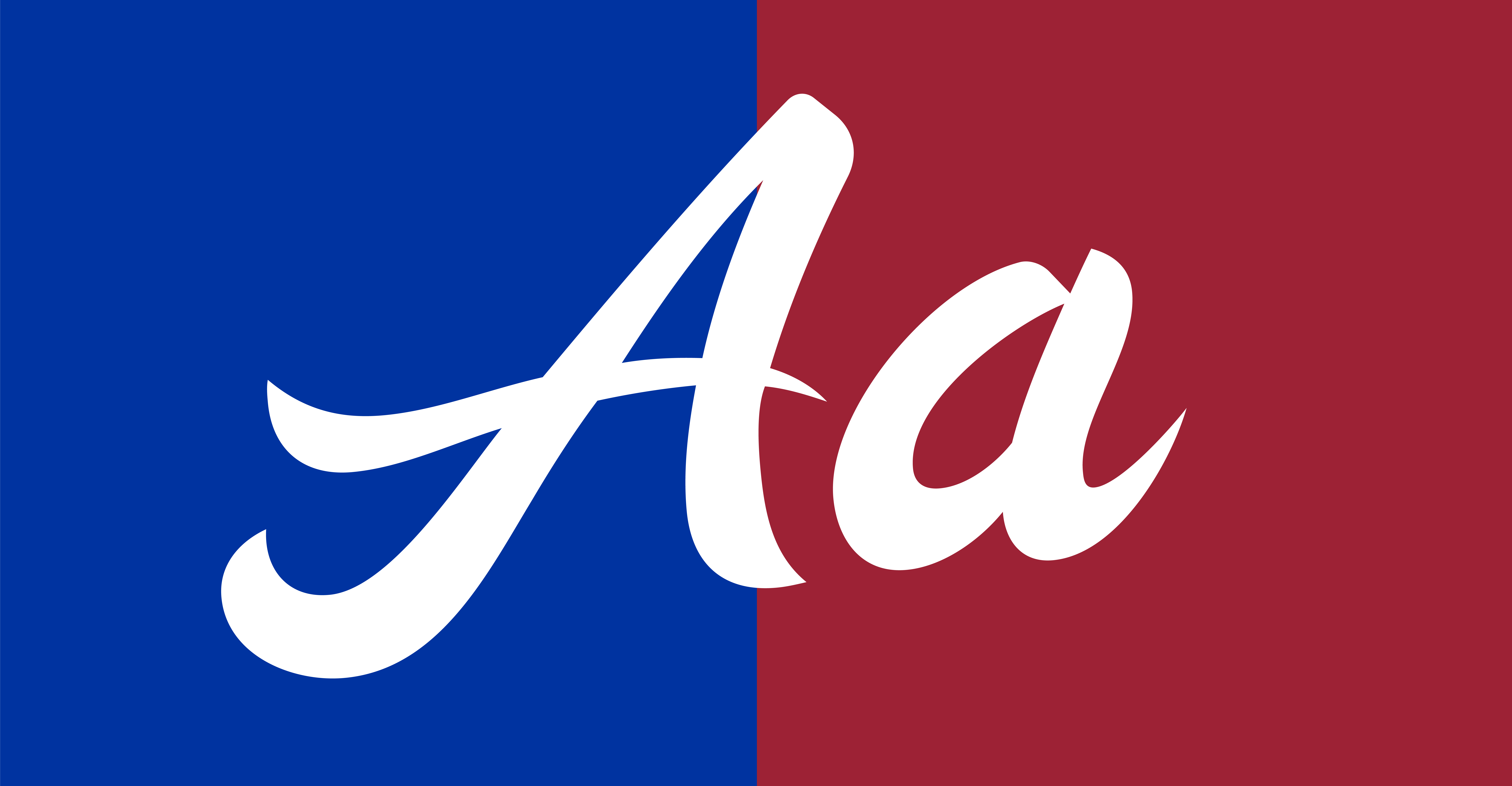
Strikeout
The Strikeout Script is a complementary, collegiate-style typeface that can be customized by the Marketing and Communications Office’s design team to suit specific brand applications.
This font is included in the shared internal Canva brand kit. Note: Access is limited to the internal PC community.
Web Font(s)
Inter is the newest font in the brand lineup, strategically introduced for web-only use in body copy across the website and other digital platforms. It is intended to coincide with the use of Univers, or to be used as a substitute when Univers is unavailable.
Aa Bb Cc
ABCDEFGHIJKLMNOPQRSTUVWXYZ
abcdefghijklmnopqrstuvwxyz
1234567890 | !@#$%^&*()
Inter
Inter is the newest font in the brand lineup, strategically introduced for web-only use in body copy across the website and other digital platforms. It is intended to coincide with the use of Univers, or to be used as a substitute when Univers is unavailable.

